The DBA Design Effectiveness Awards has a great case study about The Mail Online, and how the “rules” of web design don’t matter if you’re meeting the goals of your business and it’s customers.
Some key points made in the 12-page report:
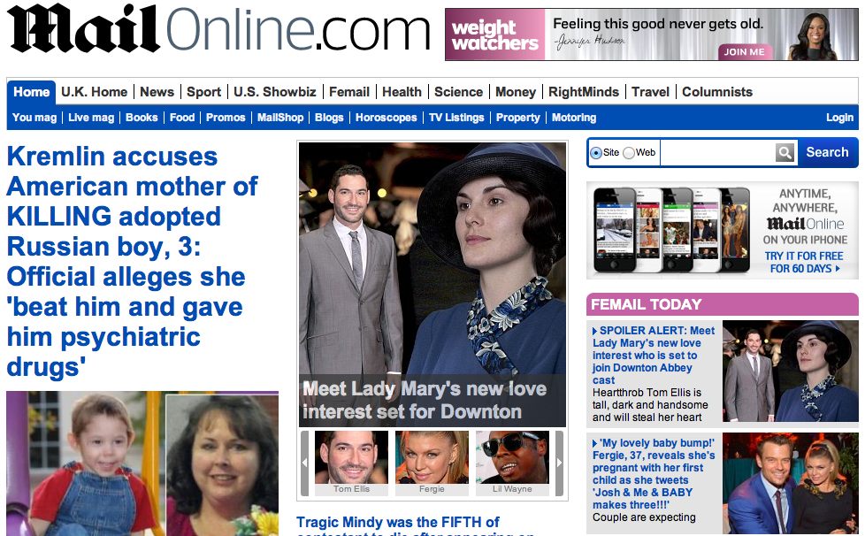
- They utilized heat-mapping and a 2-month beta period to see how users actually used the site. The results showed that readers didn’t mind scrolling, and would continue to scroll until they were bored. In response, The Mail Online created a homepage almost 3 times as tall as an average male.
- In a nod towards existing readers, they removed all advertising from the homepage, but doubled up on advertising on the rest of the site. Results were an increase in impressions, resulting in an increase in ad buys from £4.5 million to £25 million over 4 years.
- They noticed that their readers kept reading if they were offered something to read, so they created over 200 highly-optimizes SEO landing pages to help prevent dead-end stories.
Generic “web design rules” would point out that too much of the homepage is “below the fold” and “too busy”. But The Mail Online (and the agency contracted to do the redesign, Brand42) researched their readers, and the way they actually used the product, to create something that keeps them coming back – and made them the #1 visited news website in the world. Design bloggers be damned.
From Co.Design’s writeup:
So there aren’t any truly new tricks beneath the Mail Online’s hood–these are all tried-and-true online publishing strategies, just scaled up a few orders of magnitude. The Mail takes what we already know about attracting clicks and drives those principles to the breaking point.
Download the 12-page report (PDF) here.
(via Co.Design)