Categories
Reading List

Reading Today: November 27, 2014

Here’s what I’m reading this morning.

Twitter is Tracking What Other Apps It’s Users Have Installed
Twitter now knows what other apps you have installed on your iPhone and will use that to give you a better experience.

How We Did the SNL Title Sequence
A very cool behind the scenes look at how they created a great looking opening package for the 40th year of Saturday Night Live.

Squarespace Coupons
I recently signed up for a Squarespace website to create landing pages for an upcoming Harbor Hangings ad test. On their checkout, they had a space for a coupon code. The first result when Googling “squarespace coupon” is a page hosted by Squarespace giving you a 10% off code and a message saying you won’t find a better coupon code on another site. Search ended, conversion complete. Great idea that I’m going to steal for Harbor Hangings at some point.


Categories
Etsy Harbor Hangings

Another Etsy Promoted Listings Test

The “prettier pictures” test I wrote about here didn’t do anything. Literally no increase in either impressions (which was expected) or click-through rate (which was the point). Click-through rate for our Etsy Promoted Listings for my lobster prints didn’t increase at all.

I’ve started poking around some random Etsy-focused sub-reedits like r/etsy r/smallbusiness and r/etsysellers. While these are mostly quiet communities, there seem to be lots of other who are having similar problems with Promoted Listings – it doesn’t seem to be working as well as the original Etsy search ads work! It’s good to know that it’s not just me.

There seems to be one store that keeps showing up in my search results and on reddit and some of the Etsy forums: busybeeburlap. Busy Bee Burlap has hundreds of sellers and even more admirers. They sell a (relatively) similar product as I sell: small prints (but on burlap instead of paper, obviously). How are they getting so many sales?

Clicking around their site, I see they have loaded their listing titles with all kinds of keywords. Compare one of my titles…:

Maine Red Lobster Vintage-Style Illustrated Poster

…with one of their titles:

Joshua 24, As for Me and My House, We Will Serve the Lord, Burlap Print, Housewarming, Wedding, or Anniversary Present, Christian Art

Which one do you think is more likely to get search results? And more importantly, which one do you think is going to get more Etsy promoted search keywords? It’s not 100% clear how Etsy decides what keywords to use when determining promoted listing search results, but I have to assume that the title gets weighed pretty heavily. Etsy gives you 190 characters to use in the title (I was originally using about 40 characters), and I can’t imagine why they would do this if they weren’t weighing title heavily for search. So with that in mind, I’ve started testing a similarly keyword-heavy title for the lobster print test:

Maine Red Lobster Illustrated Print – Housewarming, Wedding, Birthday or Anniversary Present for Those Who Love the Beach

I’ve added this string to the end of all of my test listings:

Screen Shot 2014-11-26 at 4.11.59 PM

My hypothesis, assuming that the title is where Etsy is pulling most of their keywords, is that I’ll start to get impressions for not only “Maine” and “Lobster”, but also for more generic (but related) searches like “Housewarming” and “Beach”.

Categories
Reading List

Reading Today: November 26, 2014

Here’s what I’m reading this morning to help me focus on life, my day job and my side projects.

Life: Secrets of the Most Productive People
Bottom line: determine your own day.

Day Job: Thanksgiving Recipes Googled in Every State
I did not know that Sopapilla Casserole was a thing. And I lived in Oklahoma for 24 years.

Side Projects: Income and Progress Report for May 2014
This guy writes monthly reports on how his small business is performing. Since we’re trying to do the same thing with Harbor Hangings, I find it fascinating to read how others have succeeded (or failed) at living the dream.

Categories
Etsy Harbor Hangings

Etsy Promoted Ad Image Test

We’ve recently re-focused our efforts on our side business selling unique sealife artwork: Harbor Hangings. The goal is to build this business into something big enough that one or both of us can work on full-time. I’ve identified three channels that we’ll be focusing on in 2015: retail, online and live shows.

Screen Shot 2014-11-24 at 8.14.35 AM

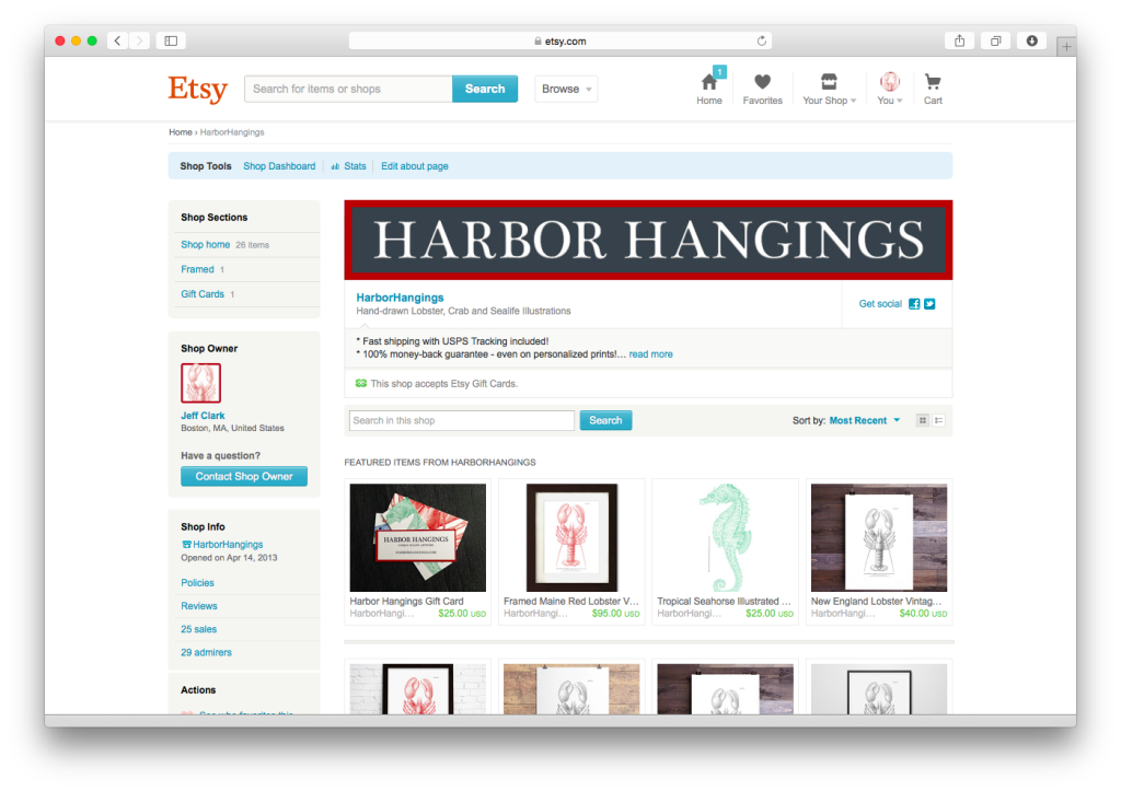
For online sales, we’re currently using Etsy exclusively. Etsy provides us with a sales platform that accepts credit cards, a built-in community of buyers and sells, and recently (as in earlier 2014) created an ad engine for promoting your listing in Etsy search results called Etsy Promoted Listings. It’s like Google ads, but Etsy-specific.

I enabled these ads for us a couple of weeks ago using our existing listing information and left the bids at whatever was suggested. The results are pretty crappy: our ads have been seen 3,500 times, clicked on 19 times, and there have been 0 purchases. 0 purchases aren’t going to give us the income necessary to quit our day jobs, so I’ve dug into the stats and found our first opportunity: ad clickthrough conversion.

3,500 ad impressions + 9 clicks = 0.005% CTR. Yikes. Granted, I’ve only spent about $3 in ads, so I’m not really upset. But if I can get that conversion rate into something respectable (1-2%, maybe?), I’d feel better about spending more money on Etsy ads – assuming the sales follow.

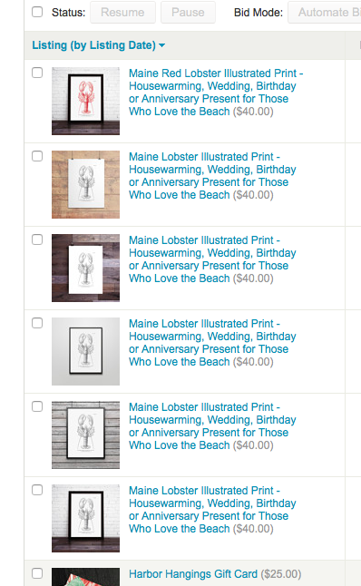
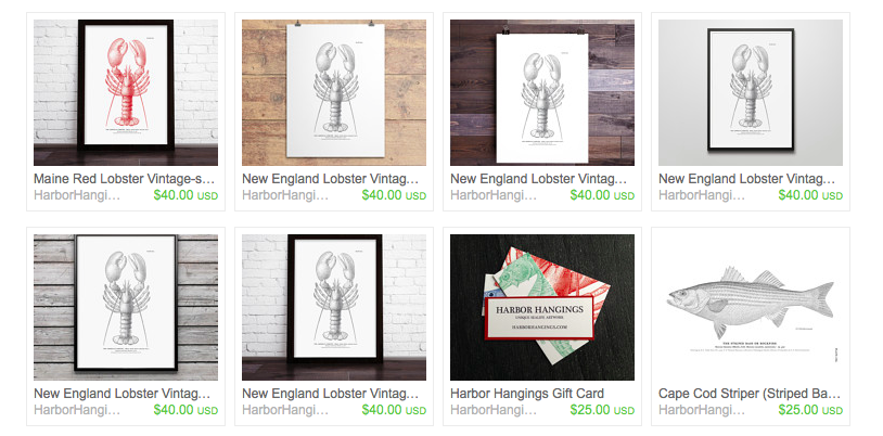
Digging into the ad analytics, I found a little pattern. Here’s a screenshot of the promoted listings screen inside my Etsy account, sorted by clicks. 18 of those 19 clicks are on pictures of physical items:

Screen Shot 2014-11-24 at 7.35.52 AM

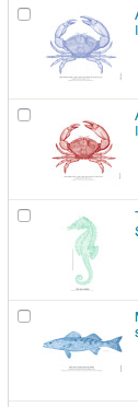
People love our items when they see them. But in my opinion, most of our items aren’t getting the attention they deserve from promoted listings. I believe it’s because the picture we use for most of our listings are pretty terrible:

Screen Shot 2014-11-24 at 8.04.42 AM


So yesterday, I started a test. My hypothesis is that the product shot, when compared against other products in Etsy search results, isn’t helping. And since the name of the game is getting people to click on the ad, I want to test this. For our lobster poster, I am running the standard product shot (my control) against with the following five test product shots:

Screen Shot 2014-11-24 at 7.37.48 AM


I’m using the lobster because it gets a lot of attention in search results, and I believe that using the lobster will get me enough impressions to consider the results significant enough to make a decision.

Product titles, descriptions, tags and prices all remain exactly the same. I even left secondary images the same on all of these posts since the primary focus of this test is to increase conversion from search ad impressions to clickthrough, and secondary images are only levers after the visitor has clicked through an ad.

Technically, it costs me $0.20 for each new test variant. $1.00 plus ad spend is worth it if we can learn something that gets us closer to closing more sales on Etsy. We also have the annoying side-effect that our storefront now hosts six variants of the exact same item.

I’ll let it run this week and see what happens. While writing this post, I developed a second hypothesis, but I’ll flesh that out after this test is over.

Categories
Professional Development Tech Work Hacks

The Absolute Best Gmail Setup

I feel like the world needs another link to this article: How to use Gmail more efficiently

It only took a couple of minutes to setup, but it changed the way I process my work email.


Categories
Professional Development Work Hacks

Save Screenshots to a Different Folder on Your Mac

As a product manager, I create a lot of screenshots when I’m making quick wireframes or reviewing a feature before it ships. And on a Mac, this means my desktop looks like a wasteland of screenshots and scattered dreams.

To combat this issue, I’ve found a quick hack to store my screenshots in a sepearte folder and make it easy to get to my latest screenshot.

  1. Create a folder under your user’s home folder called Screenshots. I’m using /Users/jeff/Screenshots
  2. Open Terminal and enter the following command: defaults write com.apple.screencapture location /Users/your-user-name-here/Screenshots. Make sure you enter the absolute path to the folder. “~/Screenshots” won’t work here!
  3. Log out of your user and back in. Now, your screenshot files should appear in your new folder, and any time you want to clear your screenshots, you can just open that folder and delete everything inside of it.
  4. For easy access, I’ve dragged that Screenshots folder to my dock:

Screen Shot 2013-09-11 at 3.50.37 PM

Categories
Design Usability Web Design

The #1 Rule of User Interface Design

Make clickable things appear clickable. Don’t make unclickable things appear to be clickable.

Print this off and put it next to your monitor. It’s not particularly clever, but it’ll save you hours of work by the time it gets to the product manager for review.

Categories
Product Management

42 Rules to Lead by from the Man Who Defined Google’s Product Strategy

Jonathan Rosenberg, Google SVP of Products recently gave a speech to graduates of Claremont McKenna about his rules to success and leadership.

My favorite line from the entire speech has to do with persuasion, especially during a meeting:

Back up your position with data. You don’t win arguments by saying ‘I think.’ You win by saying ‘Let me show you.’

Read a recap of his speech here or watch the video below.

Categories
Design Examples Web Design

Authentic Design, or: “Removing Depth Doesn’t Solve the Problem”

Smashing Magazine has a great post today about the new “minimalistic” or “flat” trend that is becoming increasingly popular lately.

While I admit I’m in the middle of a redesign of BoxRowSeat to make it more “minimalistic” and “flat” (with an emphasis on “responsive”… I know, I hate myself, too), this article hits on all the main points about what’s important if you want to follow this style. From the article:

Outlook 2013

It would be a mistake to rigidly apply a minimalist design aesthetic to an interface as a style in the hope of making the interface simpler and more digitally “authentic.” For example, ruthlessly eliminating visuals such as shadows, colors and varied background styles would not necessarily make an interface easier to use. In some cases, it would achieve the opposite by undermining hierarchy and focus, which were established by those very shadows and background colors.

Outlook 2013’s interface was updated to fit Windows 8’s modern theme. But with the interface being flattened, all of the content and menus were merged onto a single white plane, becoming more cluttered as a result.

Read the (long, but completely worth it) article at Smashing Magazine.

Categories
Design

All About MailChimp’s Logo Redesign

It’s always a little shocking seeing a company’s new logo, but MailChimp has done the impossible: made it both noticeable to people who care and unnoticeable to people who don’t.

Print

My new favorite blog, Fast Company’s design-specific blog FastcoDesign, has the entire write up of the process here.