Categories
Design Usability Web Design

The #1 Rule of User Interface Design

Make clickable things appear clickable. Don’t make unclickable things appear to be clickable.

Print this off and put it next to your monitor. It’s not particularly clever, but it’ll save you hours of work by the time it gets to the product manager for review.

Categories
Design Examples Web Design

Authentic Design, or: “Removing Depth Doesn’t Solve the Problem”

Smashing Magazine has a great post today about the new “minimalistic” or “flat” trend that is becoming increasingly popular lately.

While I admit I’m in the middle of a redesign of BoxRowSeat to make it more “minimalistic” and “flat” (with an emphasis on “responsive”… I know, I hate myself, too), this article hits on all the main points about what’s important if you want to follow this style. From the article:

Outlook 2013

It would be a mistake to rigidly apply a minimalist design aesthetic to an interface as a style in the hope of making the interface simpler and more digitally “authentic.” For example, ruthlessly eliminating visuals such as shadows, colors and varied background styles would not necessarily make an interface easier to use. In some cases, it would achieve the opposite by undermining hierarchy and focus, which were established by those very shadows and background colors.

Outlook 2013’s interface was updated to fit Windows 8’s modern theme. But with the interface being flattened, all of the content and menus were merged onto a single white plane, becoming more cluttered as a result.

Read the (long, but completely worth it) article at Smashing Magazine.

Categories
Design Mobile Web Design

Time.com Brings Responsive Web Design to the Iconic Brand

time

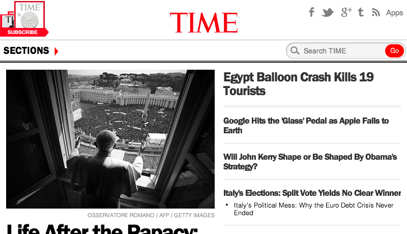
Ranked around the 600th most popular website on the Internet, when Time.com wants to change something as fundamental as the bones of their website, it makes news.

But what’s particularly interesting about their most recent change is that they are now on a completely responsive framework: ads and all. From the article on magazine.com:

One thing that we took as a given was that the advertising in a Responsive context is pretty far behind. We were not only one of the first major news sites to go Responsive, but also one of the first major consumer facing publishing sites in terms of the scale of our site and the extent to which we were rolling out the redesign. We’ve been developing the expertise for very complex ad delivery internally, but we didn’t have a perfect solution right out of the box. That would have added a significant amount of time upfront in terms of trying to understand the potential solutions that the ad community could deliver.

What we ended up doing was making sure there was a 1:1 correspondence between the various breakpoints that we were delivering. We design for six different breakpoints across devices, from desktop down to tablet, all the way down to mobile. So we asked ourselves, if we’re delivering leaderboard and rectangle on desktop, what would the corresponding units be on tablet, on both portrait and landscape mode, and then down to smartphone? What happened was at a couple of the breakpoints we realized there wasn’t a perfect fit. For example, 7 inch tablet devices in portrait mode didn’t have an analog to a 728×90 leaderboard, so we elected not to serve a leaderboard for that scenario, and instead serve only the rectangle ad. We’re working with our desktop ad server, DFP, for most devices, and we use our mobile ad server on smartphone devices, switching between both depending on the user agent. This allows us to provide advertisers a highly effective responsive program. Advertisers get the great Time.com branded user experience and their ads fall into place properly.

The end result? Mobile and tablet traffic are up and now make close to 25% of all traffic. Mobile pageviews are up 23%. Homepage uniques are up 15%. Most importantly, the mobile bounce rate is down 26%.

Read the entire article on magazine.com

Categories
Design Examples Web Design

15 User Account Page Examples From Around the Internet

I’m currently working on wireframing a new user account page for ATK, so I’ve been researching how others across the web do it.

Presented below (in no particular order, and without comment) are 15 user account page examples from across the Internet. This is the page that’s presented by these various companies when you click on “My Account”, “Account”, or similar.

Zipcar


zipcar

Verizon Wirelessverizon


Tivotivo

Site5site5

PayPal

paypal

OSLA (student loans)osla

Googlegoogle

FanDuelfanduel

Etsyetsy

eBayebay

Comcast/Xfinity
comcast

Banana Republic / Gap Brandsbanana

America’s Test Kitchen / CDSatk

Appleapple

Amazonamazon


iTunes

iTunes

Categories
Design Web Design

Four Lessons From the Web’s Ugliest (Yet, Stickiest) Website

The DBA Design Effectiveness Awards has a great case study about The Mail Online, and how the “rules” of web design don’t matter if you’re meeting the goals of your business and it’s customers.

Screen Shot 2013-02-18 at 9.49.40 PM

Some key points made in the 12-page report:

  • They utilized heat-mapping and a 2-month beta period to see how users actually used the site. The results showed that readers didn’t mind scrolling, and would continue to scroll until they were bored. In response, The Mail Online created a homepage almost 3 times as tall as an average male.
  • In a nod towards existing readers, they removed all advertising from the homepage, but doubled up on advertising on the rest of the site. Results were an increase in impressions, resulting in an increase in ad buys from £4.5 million to £25 million over 4 years.
  • They noticed that their readers kept reading if they were offered something to read, so they created over 200 highly-optimizes SEO landing pages to help prevent dead-end stories.

Generic “web design rules” would point out that too much of the homepage is “below the fold” and “too busy”. But The Mail Online (and the agency contracted to do the redesign, Brand42) researched their readers, and the way they actually used the product, to create something that keeps them coming back – and made them the #1 visited news website in the world. Design bloggers be damned.

From Co.Design’s writeup:

So there aren’t any truly new tricks beneath the Mail Online’s hood–these are all tried-and-true online publishing strategies, just scaled up a few orders of magnitude. The Mail takes what we already know about attracting clicks and drives those principles to the breaking point.

Download the 12-page report (PDF) here.

(via Co.Design)